 |
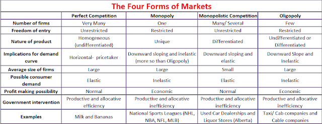
The information for this table and the graphs below came from The Principles of Microeconomics by Sayre and Morris. |
 |
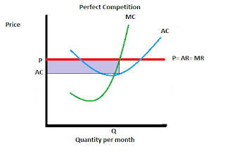
| This is a perfect competition graph. It shows that total profit is the distance between the AR and AC. |
 |
| This is a monopoly graph. It shows that output between the points where AC meets AR is profit, AR=AC, and that maximum output is where MC= MR. |
 |
| This is a monopolistic competition graph. The area shaded in light purple is the economic profit. |
 |
| This is an oligopoly graph with a kink in its demand curve because the MR is discontinued. Prices above where P meets Q rivals will not match but prices below this point rivals will match. |

No comments:
Post a Comment